Dark themes
Started by Alexander Deliyannis
on 2/1/2018
Alexander Deliyannis
2/1/2018 11:22 pm
Rightnote's latest beta includes, among several other improvements, an optional dark theme. While I haven't worked with this yet, I have acquired a strong preference for dark themes in recent months. I don't know whether it's my age, but my eyes (or my brain) seem to have become a lot more sensitive to bright screens. I've seen some comments in the forum which suggest I am not alone.
Software I've turned to, or customised accordingly, includes the Dark Reader plugin for Chrome and the equivalent Owl for Firefox, dark theme for MS Office, Sublime Text and Aeon Timeline. Unfortunately, most of the tools I use on daily basis are not 'dark friendly', at least not fully, e.g. the relevant MS Office theme is not applicable to the content itself.
Any others you can think of or use?
Andy Brice
2/1/2018 11:33 pm
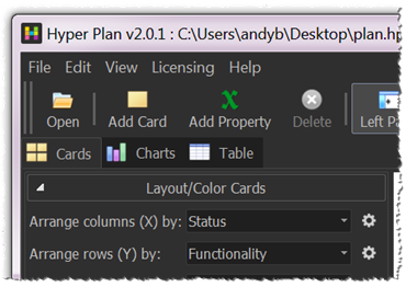
Dark themes definitely look 'sexier'. I added a dark 'skin' for Hyper Plan on Windows a while back.
http://www.hyperplan.com/assets/images/dark-style-v200.png
(it was less easy to do for Mac).
But, downloadable software being what it is, I have no idea how many people use it in preference to the default.
--
Andy Brice
http://www.hyperplan.com
http://www.hyperplan.com/assets/images/dark-style-v200.png
(it was less easy to do for Mac).
But, downloadable software being what it is, I have no idea how many people use it in preference to the default.
--
Andy Brice
http://www.hyperplan.com
washere
2/2/2018 3:45 am
On Windows & Android OSes, almost everything I use is black themed or at least dark themed. In fact I can't recall a single software which I use that has a non black/dark theme. On both Windows & Android the whole operating system has been turned black using custom hacks themes & Substratum with black themes, several of which I use. So nothing is white for me.
Those that force white, like yet another portable Office I added today (5th light suite I use now alongside MS Office) usually provide darker theme. There have been a few software I stopped using due to unhackable whiteness, but they were not in my top 15 or 50 or even 100, from among 400 or so various genres (outliner, notes, Mindmap, visual boards, tree editors, etc) I've tested & graded. I can't stand a folder window in Windows which is white anymore.
Most software are actually not mentioned on this forum. When I did search for some, like Typora was not mentioned when I first mentioned it after searching, later yet posting a link by which time others said they'd been using it. I also have a backlog of about a dozen tree editors yet to test, been waiting a few months as no time. Most relevant software are not actually mentioned here for whatever reasons. But the few which had to be white, were not in my top 100 anyway. So no loss for me. Some I had to do myself, and take time, my optimized Scrivener black theme took many hours.
And it's not just sensitive eyes which I do have. Since the 80's, high end computer graphics stations are on a black OS & even in Light controlled rooms, graded & dimmed. In the 90's some projects meant I had to use some. Same reason film color grade specialists & top photographers always had black environments to work in. The neural networks extend well into the eyes and can be trained & weighted over the years, hence why there's always been less than a dozen telecine top colorists over the decades. Like developing a taste palette or top wine tasters. Other reasons to use back/dark theme apart from sensitive eyes or training the eye to fine expert levels are:
Black backgrounds let one work much longer with less visual stress
Helps avoid night time sleep disorder
Saves on battery
Less color & light vibrations, was much worse with CRT flickers
IMO more peaceful & relaxing & soothing, as most top CGI graphic station slaves I've met testify. Microsoft has been promising a true black, including folders etc, theme for Windows for years, including beta and final last year, but they keep postponing it, and will, I know why. Too much disruption in thousands of top software. But we use our own UI/UX libs and custom themes anyway.
White background has a few advantages, not for the eyes though, but that's another story. As some girls say: Once you go black, you never go back.
https://www.youtube.com/watch?v=TJAfLE39ZZ8
Andy Brice
2/2/2018 9:31 am
I use this software to turn my monitor a pinkish shade after the sun goes down.
https://justgetflux.com/
I think it helps with sleep (although I don't have any data to back that up). It works on Windows and Mac and is free.
--
Andy Brice
http://www.hyperplan.com
https://justgetflux.com/
I think it helps with sleep (although I don't have any data to back that up). It works on Windows and Mac and is free.
--
Andy Brice
http://www.hyperplan.com
Hugh
2/2/2018 2:51 pm
Before Christmas, Scrivener developer Keith Blount commented on what full "dark mode" for the macOS version of Scrivener would require in terms of re-design:
"You're talking around 350 images that would need variants, and so around 175 code switches for that (since all images have two variants, Retina and non-Retina). Then every background element such as header bars, footer bars, inspector bars, split view dividers and so on would need alternative drawing code. Anything using colour such as labels would need alternative ways of drawing to work with dark backgrounds. Custom button selections would need alternative drawing routines. Apple elements with no dark variant, such as outline and table header bars, would need overriding and custom drawing applied. And so on..."
"You're talking around 350 images that would need variants, and so around 175 code switches for that (since all images have two variants, Retina and non-Retina). Then every background element such as header bars, footer bars, inspector bars, split view dividers and so on would need alternative drawing code. Anything using colour such as labels would need alternative ways of drawing to work with dark backgrounds. Custom button selections would need alternative drawing routines. Apple elements with no dark variant, such as outline and table header bars, would need overriding and custom drawing applied. And so on..."
Hugh
2/2/2018 3:10 pm
So somebody suggested instead "the right pair of super-chromatic sunglasses"...
Paul Korm
2/2/2018 3:20 pm
Recent versions of macOS include Night Shift, which is very similar to fLux. I used fLux for years before Night Shift came along, and agree with Andy that the effect is very useful.
The macOS accessibility settings can invert the monitor's display color. For many apps, this is more than adequate especially if they app does not natively support a dark mode.
Andy Brice wrote:
The macOS accessibility settings can invert the monitor's display color. For many apps, this is more than adequate especially if they app does not natively support a dark mode.
Andy Brice wrote:
I use this software to turn my monitor a pinkish shade after the sun
goes down.
https://justgetflux.com/
I think it helps with sleep (although I don't have any data to back that
up). It works on Windows and Mac and is free.
--
Andy Brice
http://www.hyperplan.com
washere
2/2/2018 6:13 pm
Since Jobs, Apple is philosophically and religiously fanatical about Steve's White Zen conversion, dating back to the seventies.
Turning down brightness by night time dimmers, or putting on shades which nonetheless sounds very cool to me, is not exactly a dark or better yet a good black theme either.
Finally, simple hard edged inverting is also the usual lame suggestion not to mention tasteless as the age old Microsoft High-Contrast theme, mainly for the hard of seeing, has always scared anyone with any sense of class. Instead of just a negative filter, a good black/dark theme takes a bit of work to get the selected color palette, shades, hues & complimentary placement in the color-wheel right. Might be beyond some though.
Paul Korm
2/2/2018 7:25 pm
Don't believe anyone said fLus or Night Shift were dark mode alternatives.
washere wrote:
I don't know if my suggestion was lame -- since everyone's vision is unique to them -- it was merely something to consider.
Thanks for the instruction. I'll take it to heart.
washere wrote:
Turning down brightness by night time dimmers, or putting on shades
which nonetheless sounds very cool to me, is not exactly a dark or
better yet a good black theme either.
I don't know if my suggestion was lame -- since everyone's vision is unique to them -- it was merely something to consider.
Finally, simple hard edged inverting is also the usual lame suggestion
not to mention tasteless as the age old Microsoft High-Contrast theme,
mainly for the hard of seeing, has always scared anyone with any sense
of class. Instead of just a negative filter, a good black/dark theme
takes a bit of work to get the selected color palette, shades, hues &
complimentary placement in the color-wheel right. Might be beyond some
though.
Thanks for the instruction. I'll take it to heart.
Alexander Deliyannis
2/2/2018 9:11 pm
Paul Korm wrote:
Indeed; these days I'm using a borrowed laptop where it's not installed and the effect was very tiring. So I used this opportunity to try out this recent purchase: https://www.amazon.co.uk/gp/product/B0721VVMRG I found them quite satisfactory. Apparently the 'tiring' colour is a shade of blue.
I used fLux for years before Night Shift came along, and agree with Andy that the effect is very useful.
Indeed; these days I'm using a borrowed laptop where it's not installed and the effect was very tiring. So I used this opportunity to try out this recent purchase: https://www.amazon.co.uk/gp/product/B0721VVMRG I found them quite satisfactory. Apparently the 'tiring' colour is a shade of blue.
Alexander Deliyannis
2/2/2018 9:13 pm
Andy Brice wrote:
Thanks; admittedly I didn't notice that, I'm still getting acquainted with this powerful programme of yours.
I added a dark 'skin' for Hyper Plan on Windows a while back.
Thanks; admittedly I didn't notice that, I'm still getting acquainted with this powerful programme of yours.
washere
2/2/2018 9:49 pm
I used f.lux daily for a year on my daily goto smaller typewriter-ish laptop, still scheduled on my beasty huge one. Something about the color management they do, can't put my finger on it. Most laptops have FN + Fxx key to dim lights, not color temp range though for sleep disorder.
Custom Dark themes on Windows might turn screen dead, can recover from safe mode if knowing what to do. Not for the faint hearted to mess about with. Some custom dark/black themes turned screen dead with total black with latest major win update, many still work though.
Hyper Plan dark mode is OK, good job, never used the regular theme anyway. Night Shift for mac will do. On Android for night color temp ranges, Twilight (Pro) is still best.
On Windows:
Press: Start Button
Type: Night Light
Christian Tietze
2/27/2018 3:41 pm
Recently I stumbled upon a study that I found interesting, although you shouldn't bet your livelihood on its validity: Dobres et al found recognition time of words typeset as black text on white background was 38% better (faster) than white text on black.
The reference data:
Dobres, J., Chahine, N., Reimer, B., Mehler, B. & Coughlin, J.F. (2014). Revealing Differences in Legibility Between Typefaces Using Psychophysical Techniques: Implications for Glance Time and Cognitive Processing. MIT AgeLab White Paper No. 2014-3. Massachusetts Institute of Technology, Cambridge, MA.
PDF link: http://agelab.mit.edu/files/Typeface/MT-MIT-Chinese-Word-Recognition-White-Paper_2014-06-24.pdf
Christian Tietze
2/27/2018 3:42 pm
Recently I stumbled upon a study that I found interesting, although you shouldn't bet your livelihood on its validity: Dobres et al found recognition time of words typeset as black text on white background was 38% better (faster) than white text on black.
The reference data:
Dobres, J., Chahine, N., Reimer, B., Mehler, B. & Coughlin, J.F. (2014). Revealing Differences in Legibility Between Typefaces Using Psychophysical Techniques: Implications for Glance Time and Cognitive Processing. MIT AgeLab White Paper No. 2014-3. Massachusetts Institute of Technology, Cambridge, MA.
PDF link: http://agelab.mit.edu/files/Typeface/MT-MIT-Chinese-Word-Recognition-White-Paper_2014-06-24.pdf
The reference data:
Dobres, J., Chahine, N., Reimer, B., Mehler, B. & Coughlin, J.F. (2014). Revealing Differences in Legibility Between Typefaces Using Psychophysical Techniques: Implications for Glance Time and Cognitive Processing. MIT AgeLab White Paper No. 2014-3. Massachusetts Institute of Technology, Cambridge, MA.
PDF link: http://agelab.mit.edu/files/Typeface/MT-MIT-Chinese-Word-Recognition-White-Paper_2014-06-24.pdf
Alexander Deliyannis
2/28/2018 7:21 pm
Christian Tietze wrote:
I'm sure this is valid. The famous marketing man David Ogilvy mentions the experience he had with a printed advertisement, which originally ran with white text on black background. Switching to black text on white background doubled the response rate.
If I could interact with my devices only with passive LCDs or e-ink displays (black on white), I would gladly choose them. My second choice would be amber monochrome which I found very easy on my eyes. But, alas, modern OSs and applications don't take kindly to all of these.
By the way, I found this interesting reference:
https://en.wikipedia.org/wiki/Monochrome_monitor
"Pixel for pixel, monochrome monitors produce sharper text and images than color CRT monitors. This is because a monochrome monitor is made up of a continuous coating of phosphor and the sharpness can be controlled by focusing the electron beam; whereas on a color monitor, each pixel is made up of three phosphor dots (one red, one blue, one green) separated by a mask. Monochrome monitors were used in almost all dumb terminals and are still widely used in text-based applications such as computerized cash registers and point of sale systems because of their superior sharpness and enhanced readability."
Dobres et al found
recognition time of words typeset as black text on white background was
38% better (faster) than white text on black.
I'm sure this is valid. The famous marketing man David Ogilvy mentions the experience he had with a printed advertisement, which originally ran with white text on black background. Switching to black text on white background doubled the response rate.
If I could interact with my devices only with passive LCDs or e-ink displays (black on white), I would gladly choose them. My second choice would be amber monochrome which I found very easy on my eyes. But, alas, modern OSs and applications don't take kindly to all of these.
By the way, I found this interesting reference:
https://en.wikipedia.org/wiki/Monochrome_monitor
"Pixel for pixel, monochrome monitors produce sharper text and images than color CRT monitors. This is because a monochrome monitor is made up of a continuous coating of phosphor and the sharpness can be controlled by focusing the electron beam; whereas on a color monitor, each pixel is made up of three phosphor dots (one red, one blue, one green) separated by a mask. Monochrome monitors were used in almost all dumb terminals and are still widely used in text-based applications such as computerized cash registers and point of sale systems because of their superior sharpness and enhanced readability."
Chris Thompson
2/28/2018 11:13 pm
Part of the problem is that as screen technology has improved, contrast ratios have increased substantially. Better contrast specs are desirable for watching media and a number of other applications, but for reading all the research I've seen suggests that too much contrast (either with the text and the background or between the screen and the passive bezel) actually increases eyestrain and difficulty reading for long periods. This also probably explains the popularity of low contrast color schemes like Zenburn for programmer's text editors... there are usually both light and dark mode variations of these themes.)
Not many people know about this, but there is an accessibly option on newer iOS devices called "reduce white point" that alters the screen's contrast ratio. You can add this to the Control Centre for quick access. I find this makes a huge difference in terms of fatigue reading long PDF documents.
Other features are useful too (True Tone, night modes, adjusting your reader to a lower contrast theme). But "reduce white point" is probably the most useful for me.
Pierre Paul Landry
3/1/2018 6:17 am
Chris Thompson wrote:
Humm... Do you have any reference ? I'd be interested in reading further.
The research I've read (and I actually participated in the data analysis) concludes that more light and more contrast leads to better visual performance (NRC Ottawa Canada)
http://nparc.nrc-cnrc.gc.ca/eng/view/accepted/?id=7b629e54-7850-4cf2-b635-d4bd81f57a48
Pierre
Better contrast specs are desirable for watching media and a number of other applications, but for reading all the research I've seen suggests that too much contrast (either with the text and the background or between the screen and the passive bezel) actually increases eyestrain and difficulty reading for long periods.
Humm... Do you have any reference ? I'd be interested in reading further.
The research I've read (and I actually participated in the data analysis) concludes that more light and more contrast leads to better visual performance (NRC Ottawa Canada)
http://nparc.nrc-cnrc.gc.ca/eng/view/accepted/?id=7b629e54-7850-4cf2-b635-d4bd81f57a48
Pierre
Chris Thompson
3/1/2018 4:31 pm
The paper you link to isn't about reading -- it's about something closer to reaction times in a video game situation.
For reading and eye strain, this is one example:
https://www.sciencedirect.com/science/article/abs/pii/S0169814199000402
Basically their finding is that a very modest amount of luminance contrast (8:1) is optimal for reading, after which readability actually decreases. Which actually isn't that surprising when you think about it. If you had a display where the whites were as bright as the sun, and the blacks were perfectly, totally non-reflectively black, it would be hard to read.
This is probably consistent with people's experience with e-readers. E-ink doesn't have a particularly good contrast ratio, but it is adequate and roughly in the sweet spot for reading. Whereas today's 200:1 IPS displays score well on spec charts and are great for video and games but are not that good for reading.
-- Chris
Pierre Paul Landry wrote:
Chris Thompson wrote:
> Better contrast specs are desirable for watching media and a number of
other applications, but for reading all the research I've seen suggests
that too much contrast (either with the text and the background or
between the screen and the passive bezel) actually increases eyestrain
and difficulty reading for long periods.
Humm... Do you have any reference ? I'd be interested in reading
further.
The research I've read (and I actually participated in the data
analysis) concludes that more light and more contrast leads to better
visual performance (NRC Ottawa Canada)
http://nparc.nrc-cnrc.gc.ca/eng/view/accepted/?id=7b629e54-7850-4cf2-b635-d4bd81f57a48
Pierre
Pierre Paul Landry
3/1/2018 6:13 pm
Chris Thompson wrote:
Well not quite. The tasks were white sheets of paper with numbers (of various shades of grey / black).
Performance was evaluated based on subjective confort and time to read.
Too bad only the abstract is available online for free :-(
True of course. But the experiment I referred to was about indoor lighting, where lighting levels were nowhere close to the sun.
Its conclusion was that higher lighting and higher contrast leads to better visual performance.
Pierre
The paper you link to isn't about reading -- it's about something closer to reaction times in a video game situation.
Well not quite. The tasks were white sheets of paper with numbers (of various shades of grey / black).
Performance was evaluated based on subjective confort and time to read.
https://www.sciencedirect.com/science/article/abs/pii/S0169814199000402
Too bad only the abstract is available online for free :-(
If you had a display where the whites were as bright as the sun, and the blacks were perfectly, totally non-reflectively black, it would be hard to read
True of course. But the experiment I referred to was about indoor lighting, where lighting levels were nowhere close to the sun.
Its conclusion was that higher lighting and higher contrast leads to better visual performance.
Pierre
Alexander Deliyannis
3/7/2018 9:51 pm
Pierre Paul Landry wrote:
Indeed, I see that the experiment evaluated "visual performance" based on the "reaction times for detecting square targets of different contrasts..." While this may be relevant and useful in many situations, I would not rely on its conclusions for longform reading. Would the same conditions hold in respect to both a 100m race and a marathon?
Further, statistics is one thing, individual cases are another. I see that the experiment used in total 9 subjects aged 17 to 31. I am 50, have always disliked fast-moving video games and preferred natural light -even dim- for reading, even as a child. Am I going to switch to high contrast settings for my monitors any time soon? No, definitely not.
Chris Thompson wrote:
> The paper you link to isn't about reading -- it's about something
closer to reaction times in a video game situation.
Well not quite. The tasks were white sheets of paper with numbers (of
various shades of grey / black).
Performance was evaluated based on subjective confort and time to read.
Indeed, I see that the experiment evaluated "visual performance" based on the "reaction times for detecting square targets of different contrasts..." While this may be relevant and useful in many situations, I would not rely on its conclusions for longform reading. Would the same conditions hold in respect to both a 100m race and a marathon?
Further, statistics is one thing, individual cases are another. I see that the experiment used in total 9 subjects aged 17 to 31. I am 50, have always disliked fast-moving video games and preferred natural light -even dim- for reading, even as a child. Am I going to switch to high contrast settings for my monitors any time soon? No, definitely not.
Dr Andus
3/10/2018 4:14 pm
Alexander Deliyannis wrote:
I'm not a medical expert, but I also suspect that individual characteristics matter. There are all kinds of factors that affect sensitivity to light (incl. genuine chronic medical conditions), which then would influence preferences. We're talking genetic make-up, which differs from person to person.
I tend to write my diary entries at the end of the day, when it's dark, right before going to sleep, and I noticed that I much prefer to do this using light-coloured font against a dark theme ("Idle Fingers" in Caret, a Chrome app). Somehow I find it easier to focus on the lines I'm typing.
My desktop wallpaper is set to dark grey on all my laptops, and I'm annoyed every time I navigate to some super-white and bright website (except OutlinerSoftware.com, where the benefits of the content outweigh the discomfort ;-)
Further, statistics is one thing, individual cases are another. I see
that the experiment used in total 9 subjects aged 17 to 31. I am 50,
have always disliked fast-moving video games and preferred natural light
-even dim- for reading, even as a child. Am I going to switch to high
contrast settings for my monitors any time soon? No, definitely not.
I'm not a medical expert, but I also suspect that individual characteristics matter. There are all kinds of factors that affect sensitivity to light (incl. genuine chronic medical conditions), which then would influence preferences. We're talking genetic make-up, which differs from person to person.
I tend to write my diary entries at the end of the day, when it's dark, right before going to sleep, and I noticed that I much prefer to do this using light-coloured font against a dark theme ("Idle Fingers" in Caret, a Chrome app). Somehow I find it easier to focus on the lines I'm typing.
My desktop wallpaper is set to dark grey on all my laptops, and I'm annoyed every time I navigate to some super-white and bright website (except OutlinerSoftware.com, where the benefits of the content outweigh the discomfort ;-)
Dr Andus
3/10/2018 4:35 pm
Alexander Deliyannis wrote:
Alexander,
Do you have any concerns about this Chrome extension spying on you? I see that permissions need to be enabled for it to access all information on the pages visited, so I'm a bit wary giving someone (especially outside of EU jurisdiction) that level of access.
Software I've turned to, or customised accordingly, includes the Dark
Reader plugin for Chrome
Alexander,
Do you have any concerns about this Chrome extension spying on you? I see that permissions need to be enabled for it to access all information on the pages visited, so I'm a bit wary giving someone (especially outside of EU jurisdiction) that level of access.
Alexander Deliyannis
3/10/2018 6:32 pm
Dr Andus wrote:
I've (rightly or wrongly I have no idea) assumed that the "all information" is related to the extension's need to tamper with the code of the page.
The extension works instantly so I don't think that it sends anything anywhere; it all seems to happen locally. I have not done any test to confirm this though.
Do you have any concerns about this Chrome extension spying on you? I
see that permissions need to be enabled for it to access all information
on the pages visited, so I'm a bit wary giving someone (especially
outside of EU jurisdiction) that level of access.
I've (rightly or wrongly I have no idea) assumed that the "all information" is related to the extension's need to tamper with the code of the page.
The extension works instantly so I don't think that it sends anything anywhere; it all seems to happen locally. I have not done any test to confirm this though.
washere
3/10/2018 7:15 pm
Looking at my Mac is like staring into a filming light, might recognize text faster but can't last long staring at a floodlight.
I prefer grey fonts on black, not white. Sometimes mellow amber font or similar, depends on the software theme.
Have not been reading sites in white for years, on laptops desktops tablets phones etc. My Windows/Android OSes are blacked too, folders, sys, etc. This chrome extension I've used for a long time with a loooong list of sites to blacken, IIRC someone mentioned it in this thread too:
https://ibb.co/dTnMcn
Alexander Deliyannis
3/12/2018 11:59 pm
Atomic Scribbler, previously mentioned here http://www.outlinersoftware.com/topics/viewt/7715/ and here http://www.outlinersoftware.com/topics/viewt/7991/0/pagefour-now-free--to-be-superseded-by-atomic-scribbler has now dark theme; it can be seen at the gallery here https://www.atomicscribbler.com/Home/Gallery/
1
2